Nutrient Adequacy and USDA Food Patterns
Do your clients ever wonder why the USDA advises people to follow MyPlate and the Dietary Guidelines for Americans?Perhaps this chart would be helpful!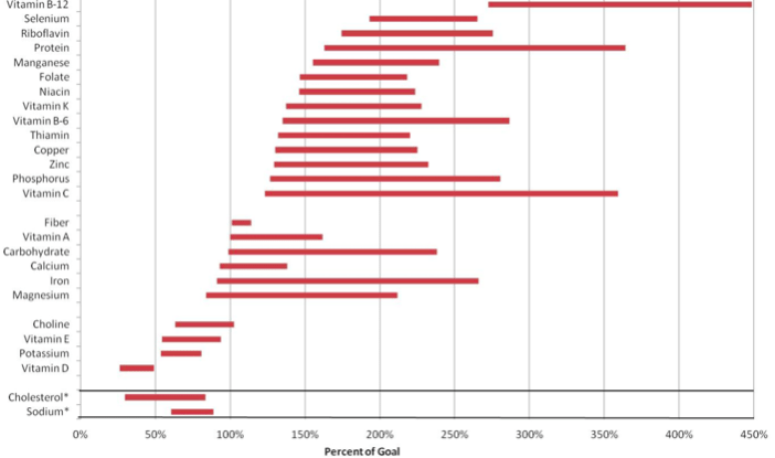 What you see here is excerpted from Appendix E of the scientific report of the latest edition of the Dietary Guidelines for Americans. It is titled “Range of nutrient levels in USDA Food Patterns across all age/sex groups, expressed as a percent of nutritional goal for each group. Bars show the lowest to highest percentage of the RDA or AI met by the USDA Food Patterns for each nutrient for any age/sex group.” As you can see, eating from food groups is a fantastic way to ensure that you get all the nutrients you need in a day or week. This research is what informs and shapes the food groups, ensuring nutrient adequacy in the diet.The USDA sums up the process of researching and adjusting the food groups in the same appendix that this graphic is from, appendix E-3.1. They assert “The USDA Food Patterns are intended to represent the types and amounts of foods that will provide nutrients sufficient to meet IOM nutrient recommendations and Dietary Guidelines for Americans recommendations. They are updated every five years during the deliberations of the Dietary Guidelines Advisory Committee, and are presented to the Committee for their assessment of the Patterns’ adequacy. As part of the update, amounts recommended from each food group may be modified to reach all or most of the specified goals. In addition, the amounts from each food group are compared to usual dietary intake patterns of the U.S. population, and kept within the normal range of consumption.”You can get this information in a brand-new printable handout! How will you use your copy?
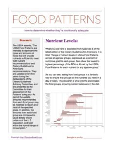 Of course, there are lots of other resources to help you guide your clients in their shifts to healthier eating patterns. And, now that you have the opportunity to show them this graph of nutrient adequacy in the USDA food patterns, you can take those lessons to the next level! Here are a few of the materials we whipped up to support educators with the 2015 edition of the Dietary Guidelines for Americans.
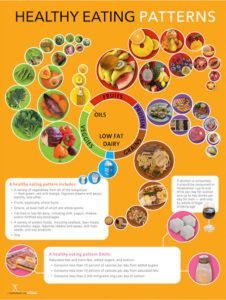 This engaging poster displays popular choices from each food group. It will help individuals make the healthiest choices and eat a variety of foods! The poster also has reminders about how many foods people should choose from each group, and it explains the new guidelines about added sugars, saturated fat, and sodium. It also reminds them to limit alcohol intake. It's packed with great information!The vibrant flowing circles use high-quality food photos and it's certain that this picture speaks a thousand words. This poster also supports the vegetarian healthy eating pattern and the Mediterranean healthy eating pattern from the USDA. These patterns can also be used as guides to plan and serve meals not only for the individual and household but in a variety of other settings, including schools, worksites, and other community settings.This poster comes with a free handout that will be automatically delivered to your inbox.
 The 2015 Dietary Guidelines for Americans is the one show you need now to get individuals up-to-date on all of the latest research presented by the Dietary Guidelines for Americans 2015 Expert Panel!The concepts presented in this show are easy to understand and follow. The best thing about the 2015 Dietary Guidelines for Americans is that the panel managed to uphold all of the standards from previous years with a no-nonsense approach to getting enough of the right nutrients while lessening the 3 elements that most people overeat.This comprehensive show comes with over 50 slides that are based on photographs that beautifully illustrate and sell key health messages to your audience. The presentation also comes with 5 PDF handouts that are ready to help everyone understand key messages.
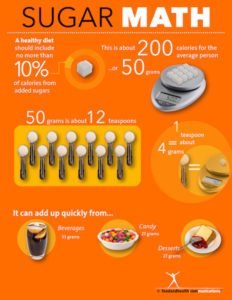 10% of your calories can come from sugar. The average American eats two to three times this amount and that is one factor that leads to overweight and obesity. The 2015 Dietary Guidelines for Americans panel of experts chose sugar consumption habits as one of the major changes that is needed by consumers. 10% of daily calories is the amount recommended by the World Health Organization and many research studies.Most of the sugar in the diet comes from beverages, desserts, and candy or other processed snacks. One can of soda contains about 33 grams of sugar so it is more than a half day's supply for most people. If you add a cup of sweetened yogurt you are already at your limit when you did not even have dessert yet.Use this poster in classrooms, wellness fairs, cafeterias, employee break rooms, hallways, bulletin boards, offices, and anywhere you want to remind people about their sugar budget. The bright colors are people-pleasing and motivational. They are warm and positive. The math is always fun for kids and adults alike. Watch their faces light up as they show off their sugar math skills to friends and coworkers. The kids will have fun tripping up their parents.And of course there's always more in the Nutrition Education Store! Here are some other great resources from the 2015 edition of the Dietary Guidelines for Americans...[shopify embed_type="product" shop="nutrition-education-store.myshopify.com" product_handle="2015-dietary-guidelines-poster" show="all"][shopify embed_type="product" shop="nutrition-education-store.myshopify.com" product_handle="sodium-math-tearpad" show="all"][shopify embed_type="product" shop="nutrition-education-store.myshopify.com" product_handle="sugar-math-poster-2015-dietary-guidelines" show="all"]
